Brand guidelines · v1.0 · October 2026
The system, written down.
Two inks, one ground, three signals, one line weight, three typefaces, and a rule for how loud a color is allowed to get. This page is the book, rendered with the thing it describes: every mark, value and glyph below is the same file the site and the print stock run on.
- Mark
- Wordmark and monogram, in a Rec Crop frame, on both grounds
- Inks
- Night and Starlight, with Moonlight as the light ground
- Signals
- Phosphor, Safelight, Tally, each with a ground-specific value
- Type
- Reross Quadratic, Newsreader, EB Garamond
- Icons
- 24 grid, 1.25 stroke at 24px, round caps, one color
The mark, built
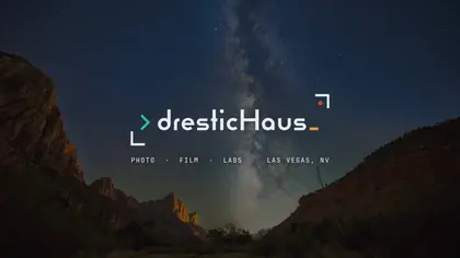
Three cuts of the same drawing: the studio lockup, the Labs lockup and the monogram. The Rec Crop frame is the constant. Clear space is one quarter of the frame's height on every side, measured from the outer stroke, and nothing else may enter it: no type, no rule, no photograph, no second logo. Below that boundary the mark stops reading as a frame and starts reading as a sticker.
What breaks it
Every one of these has shown up in a deadline somewhere. The rule is short: the mark is drawn once, placed once, and never adjusted.
Palette
Ink and ground
Two inks, one ground. Everything structural is built from these three.
#0B0D12Ink on light. Logo frame, wordmark, headlines, body. Dark mode ground.
#E8ECF1Ink on dark grounds. Cool blue-white, like starlight.
#F2F4F6The default light ground: site, documents, the book.
Signals
Each signal has a job and a light-ground and dark-ground version so it holds contrast anywhere.
#00897BThe glow of a terminal screen. Prompt on light, the code side, Labs.
#26C6A6Prompt on dark. Teal that survives a night ground.
#00695FLinks and teal text on light.
#E39B3AThe darkroom amber. Cursor on dark, never a fill.
#B87318Cursor on light.
#8F5A12Amber text on light.
#D9412EThe REC light on a camera that is recording.
#B5301FError text on light.
Support
Surfaces and quiet text. Dust is dark-ground only; it will not hold on Moonlight.
#141B2DRaised dark surfaces, footer, video page.
#565B66Secondary text on light.
#8C909ASecondary text on dark only.
#C4602FVegas rock. Print and merch accents.
#FFFFFFPhoto mats and print stock.
Proportion, from the book: Moonlight 52%, Night 26%, Starlight 12%, and the signals inside the last 10%. If a layout looks like a candy store, pull it back to Night and Starlight.
Type
Las Vegas photo and video
Headlines only, 32px and up. Outlined in every exported file so nothing depends on an installed font.
Headshots, conferences and elopements, delivered in 48 hours.
Every paragraph, form and caption. 400 for prose, 600 for emphasis, never both in one line.
36.1° N, 115.1° W · ISO 3200 · 20s
Labels, coordinates, rates, file names. Uppercase, tracked, never longer than a line.
Glyphs
Seventy-four line icons on a 24px grid: 1.25 stroke at 24px, 1.5 at 32px and up, round caps and joins, one color, 2px padding inside the box. Night on light, Starlight on dark, Phosphor only for an active or selected state. Twelve of the set below, straight from the masters. Anything the seventy-four does not cover falls back to Phosphor rather than being improvised.
In use